The Looker Studio Template
The Anomaly Detection module includes a Looker Studio template connected directly to your anomaly_detection_report table. This guide walks through each part of the dashboard.
👉 Open the Anomaly Detection dashboard template
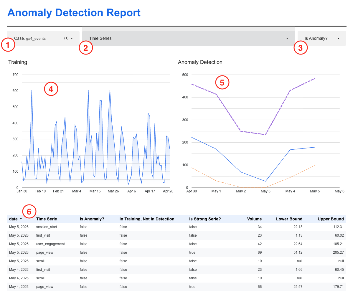
The filters
Three filters run across the top of the dashboard.
① Case selects which monitoring case you are looking at. Each case corresponds to one entry in your cases configuration, for example ga4_events or ga4_sessions. If you have multiple cases, use this filter to focus on one at a time.
② Time Series lets you drill into a specific series within the selected case. For ga4_events, each series is one event name. Selecting a value here updates both charts and the table to show only that series.
③ Is Anomaly? filters the data table to show only flagged rows. Leave it open when exploring. Switch to true when you want to focus on what the model flagged.
The Training chart
The left chart shows the historical data the model was trained on, typically the 90 to 120 days before the detection window. This is the baseline the model used to learn what normal looks like for each series.
Use this chart to sanity-check the baseline. If the training period contains a major disruption (a product launch, a tracking outage), the model's sense of normal may be skewed. A healthy training window shows a relatively stable pattern of variation.
The Anomaly Detection chart
The right chart shows the detection window: the recent period the model is actively scoring.
- Solid blue line: the actual metric value
- Purple dashed line: the upper confidence bound
- Orange dashed line: the lower confidence bound
When the blue line stays inside the corridor formed by the two bounds, the model considers the value normal. When it crosses outside, the model flags an anomaly.
Note that both bounds are clamped at zero. A lower bound that the model predicts below zero will appear as zero in the chart.
The data table
The table below the charts shows one row per date and time series. The key columns:
| Column | What to look at |
|---|---|
| Time Series | The dimension value identifying this series (e.g., an event name or channel) |
| Is Anomaly? | true when the model flagged this point as outside expected bounds |
| In Training, Not In Detection | true when this series appeared in the training window but has no data in the detection window, which may signal data loss |
| Is Strong Series? | true when this series has enough history and volume to produce reliable signals |
| Volume | The actual metric value for this date |
| Lower Bound / Upper Bound | The model's confidence interval; null when the series did not meet detection quality thresholds |
When Lower Bound and Upper Bound are both null, the series did not meet the minimum quality thresholds for detection (detection_min_series_days or detection_min_series_avg). The model has no reliable baseline to score against for that series.
Separating signal from noise
Not every flagged row is worth investigating. The dashboard surfaces all anomalies; it is up to you to filter by signal quality.
Apply these three checks before acting on a result:
- Is Strong Series? = true: Series with insufficient history produce unreliable flags. A brand-new campaign with two weeks of data is not ready for anomaly detection.
- Meaningful deviation: Compare Volume against Lower Bound and Upper Bound. A 5% miss near the boundary is different from a 40% drop well outside the range.
- Persistence: Real problems tend to repeat. If the same series is flagged on two or more consecutive days, that is stronger evidence than a single-day anomaly.
The Is Anomaly? filter gives you the flagged rows. The three checks above help you decide which ones are worth escalating.
Next steps
To build alert queries directly against the output table, see the Query Library.